 When a website is designed, the focus is often on how it looks.
But the key business question should be whether the design will lead to profitability or not.
If the web design doesn't take the following tips into consideration, its profitability will suffer.
(For non-profit websites, “profitable” just means that your website generates more donations than what it costs to run it.)
As with many things in business, determining profit is simple: You subtract costs from revenue.
The same is true for a website. Take the total revenue generated via the site, subtract the total costs to design, build, and maintain the site, and you've got your website profit number.
The lower you keep your website costs, the higher its profit. (If you want to find out some ways to minimize your costs, get in touch.)
Keep the logical structure of the site simple. This is how many and what pages you have, and how they link to each other.
The site navigation and overall design should also be simple, clean, and intuitive.
Use words your site visitors are likely to use, which are not necessarily the words you'd use inside your company or industry.
— For example, you might say “automotive parts” while your visitors say “car parts”. Speak their language and your site will be more effective.
A website is not a newspaper or magazine. Less really is more! Minimize any distractions and help direct visitors' eyeballs to the key things.
 Be aware of “Hick's Law” which says the more choices someone has, the harder it is and the longer it takes for them to make a decision.
This applies to the number of products / services you offer online as well as the process to complete the sale (the fewer steps, the better).
Every web page on your site should have one goal and/or call-to-action (CTA). Ask yourself, “After a site visitor looks at this page, what do I want him to do?” Then make that action very clear and very obvious.
— For an eCommerce site, this could be a “Buy Now” button.
— For a non-profit site, it could be asking for a donation or for someone to volunteer.
— For a more informational site, it could be a button or web form that lets the visitor get in touch with you.
Anticipate the common “objections” to your offerings and address them, either in the web page sections you describe them or in an “FAQ” section.
— Objections are things like “It costs too much” (show how the value it provides exceeds the cost), “Can I return it if I don't like it?” (show a customer-friendly return policy), or “How do I know my donation isn't wasted?” (show how donated funds achieve your mission).
If appropriate, show comments from people who used your product or service and have something nice to say. But make sure to get their permission before posting it, especially if you want to use their names.
Make your customer service information and contact methods very clear and easy to find.
There are three main types of website: Sites selling physical products, sites selling services, and sites providing information.
All of them should follow the guidelines above, but there are some additional things sites should consider based on their type…
For eCommerce sites selling physical products, it's often easier, faster, and less expensive to use existing platforms like Shopify than to hire developers to build a custom solution. If a platform like Shopify has most of what you need, don't spend a lot of money to reinvent the wheel.
![]() Example: Harry's Razors started their business selling on Shopify. In less than a year, they had over 100,000 email subscribers and raised over $100 million of investment capital. In 2020, they sold the business for $1.4 Billion. And it all started with a $30/month Shopify plan!
Example: Harry's Razors started their business selling on Shopify. In less than a year, they had over 100,000 email subscribers and raised over $100 million of investment capital. In 2020, they sold the business for $1.4 Billion. And it all started with a $30/month Shopify plan!
If you have a small number of products to sell, you don't even need a platform like Shopify. A good web developer can seamlessly integrate your website with a payment processor like Stripe.
The primary tip of web design for product sites is to put intense focus on the products. Raise awareness of the problems your products solve, then drive the site visitor to the “Buy Now” button.
For sites selling services, find your “unique selling proposition” (USP). This is the thing that makes you and your services stand out from your competitors. Your website design should make your USP quite prominent.
 Clearly describe the problems your services solve, along with common objections and your proactive responses to them.
If possible, limit your service offerings to three or fewer packages so you don't overwhelm people (see Hick's Law above).
Show your offerings with their features and prices. Sometimes a comparison chart is helpful, too.
The primary tips of web design for sites selling services are to differentiate yourself, show the problem / solution high up on the home page, show testimonials if you can, and offer some type of guarantee that minimizes risk for the buyer.
For sites that don't sell anything, but instead share information, really good web-based copywriting is critical.
There are professional web copywriters who understand how website visitors scan and read web page content and their services are often well worth it (Get in touch if you want some referrals).
 It's also important to organize your content well so that it's logical and intuitive for your site visitors.
As with the other types of sites, it's still important to think about what you want people to do on each web page, even if that's just going to another page on your site for additional information.
The primary tip of web design for informational sites is to “open a dialogue” with site visitors. Provide ways for them to submit comments or questions, or simply get in touch.
If appropriate, you might want to collect email addresses so you can send out email newsletters that help you stay on their radar. Let us know if you want more info about email list and/or newsletter management.
You wouldn't start building a house without a blueprint. So don't build a website without one either.
Do some whiteboarding or sketching on paper first. Figure out what you want to put on your site and how to best organize it.
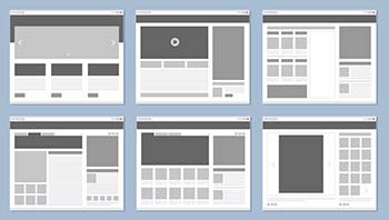
 Once you've done that, you can think about actual web page layouts and create some wireframes to outline them. (If you don't feel comfortable doing this, a good web designer should be able to help.)
Since more than half of all website visitors are now on tablets and mobile devices with smaller screens, it is critical that your site be designed and build to be “fully mobile responsive”. If you work with a web designer and/or developer, confirm that they're doing this.
Good typography is important for optimal readability and legibility, especially if you serve audiences that might be older and/or have vision issues. Fonts that look great on paper don't necessarily look good online. Again, a good web designer should be able to steer you in the right direction regarding typography.
Remember the 7-second rule. People have really short attention spans online, so use eye-catching headlines and compelling images to convey your message and drive visitors to your call-to-action.
 For images, use faces if appropriate - our eyes naturally gravitate towards them. If you have a product, an image of a person holding it is much better than just a plain product image.
Pay attention to the speed of your website. The faster it loads, the fewer people will click away. And better speed performance also helps boost your ranking in Google search results, especially on mobile devices.
Make sure your web developer integrates Google Analytics into your site. After it's been up and running for about a month (and then periodically after that), examine the data collected so that you can understand who's visiting your site, which pages they look at the most, and what actions they take. Use this insight to improve the design and/or content so user experience is optimized.
If you like this kind of info, get it sent right to you.
Yes, Send It To Me!
There are a lot of ways to design a profitable website.
Many of them are low- to no-cost and just require some up-front thinking and planning.
A good web design can make the difference between a website that doesn't produce any net profit and one that is highly profitable.
Get in touch if you'd like a free, no-obligation evaluation of your website to see how its design may be affecting its profitability.