You would have to go back at least 350,000 years, before the earliest Neanderthals lived, to find a world without design.
By the time of the Neanderthals, even the most primitive tools were designed by someone.
That person (let's call him “Zog”) had to think about how he was going to make a tool. Zog had to consider things like the materials available, how durable they'd be, how he'd need to hold the tool, and how long it would take to make.
 This early type of design was mainly focused on functionality. Modern design, in the physical world and on websites, takes many other factors into consideration as well.
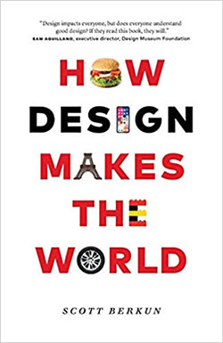
In his recent book, How Design Makes the World, designer and best-selling author Scott Berkun shows how good design can change society for the better and how bad design can cause major, and even life-threatening, problems.
When you realize the impact of design, as this enjoyable-to-read book explains, you'll start to see physical objects and websites in a new light.
To see the web without design, you won't meet Zog because you only have to travel back about 30 years.
In the early days of the Internet, there were no web browsers, no images, no videos, no animations, no sound, no eCommerce, and no social media.
Back then, the web was text-based and viewed on monochrome computer monitors that could show 24 lines of 80 characters each. The only thing even remotely close to “design” was whether the monitor showed green text or amber text.


The first web users were researchers and academics and didn't care about design. This web was really just an online repository of text documents that could be hyperlinked to each other.
In the early web, which had no design, function prevailed over form.
In the early 1990's, software engineers created a user-friendly web browser called Mosaic that was able to display graphics.
The earliest use of design on the web had arrived!
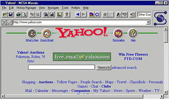 But it wasn't much…
Web pages were still mostly text. But now that they could include images, design issues arose:
How large should the images be? Where on the page should they go? How many images can a web page have before it becomes horribly slow to load?
By mid-decade, around 1995, there were fewer than 24,000 websites in total (versus about 1.8 billion now).
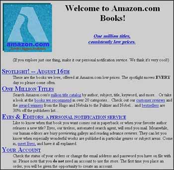 Web designers did not exist. Web developers did not exist.
websites were built by software engineers, a group of people often lacking any formal design training (I know because I was one and had none!).
So while websites were relatively easy to build, very little thought went into their design aspects. And it showed…
Early websites were really just online versions of daily newspapers and company product brochures, with very similar designs. No one considered that people read online information differently than they read printed material.
With web browsers able to show graphics, the battle for attention began. Colorful images and various fonts were used to grab eyeballs. To some people, this first phase of web “design” was very crude and basic.
 Eventually some design experts from the print world migrated to the web and began improving it.
Concepts of color balance, proper font usage, layout, white space, and other things started making websites nicer to look at.
With websites starting to generate a significant portion of some companies' revenue, they realized it wasn't enough to simply convey information and provide a way for site visitors to interact and buy things. The design of websites became as important as their content.
Now that we've had a quarter century of web design evolution, it's safe to say that web design has become as valuable, necessary, and critical as other areas of design.
If you like this kind of info, get it sent right to you.
Yes, Send It To Me!
The design of physical world objects, such as doors, causes people to behave certain ways. (Have you ever pushed a door that said “pull” because the handle seemed to be the type you pull?)
Web design is just as impactful and perhaps more so, because it's so easy to click away.
There are simple aspects of design, like the colors used, that consciously and unconsciously affects user behavior. And there are more complex factors, such as the juxtaposition of text and images that also play a role in what users do on a website.
Any business that wants its website to provide a positive return-on-investment would benefit by using an experienced web designer who understands how design decisions influence the behavior of site visitors to align with the business goals.
20 years ago, when everyone used the web on a computer with a similar screen size, a website only had to have one design.
Now, web design has become quite sophisticated and focuses on usability and accessibility.
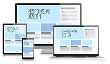 The way a website looks depends on whether you're viewing it on a large desktop, a laptop, a tablet, or a smartphone.
Web designers can manipulate the layout and functionality so all website visitors have a good experience regardless of screen size.
And good web designers make sure their designs are accessible by people with visual, physical, cognitive, and other challenges.
This addresses things like color contrast between the text and background color, font size, overall layout, and using “alt” tags on images for screen reader software.
Modern web browsers have the ability to do some amazing things. Some effects, like animations and parallax scrolling are merely “eye candy”. But other functionality can be quite helpful, like techniques for customizing content for each visitor and showing or hiding information as needed.
A web visitor in 1990 would see no design in place. Now, 30 years later, it's extremely rare to see a site without web design. (I'm looking at you, craigslist!)
 As designer Scott Berkun says in his book How Design Makes the World,
“Everything you use, from your home to your smartphone, from highways to supermarkets, was designed by someone. What did they get right? Where did they go wrong?”
The statement now also applies to websites, and the questions about getting things right or wrong are just as applicable. The value web designers provide is getting things right.
In the physical world, a poorly-designed can opener may end up in the junk drawer. But on the web, a poorly-designed site can result in a huge loss of revenue for a company.
If you like this kind of info, get it sent right to you.
Yes, Send It To Me!
The next time you pick up a can opener, or visit a website, think about how much its design affects how you're likely to use it.
Design does indeed make the world and design makes the web as well!
Get in touch if you'd like a free, no-obligation evaluation of your website to see how its design may be affecting its performance.