Landing pages are not full websites. They're usually simple, single web pages that serve one purpose. They might live within your website or be at a different web address.
They are often used as the “destination” for PPC ads1, lead magnets2, or content marketing3.
The goal of a landing page is to quickly capture the visitor's attention and get him to take an action. That could be making a purchase, subscribing to your mailing list, providing info so you can contact him, or going to your main website.
For a landing page to be effective, and give you the desired result, it should be built with the following guidelines in mind.
1 – It should load fast
On average, about 70% of people who leave a web page early (its bounce rate) do so because it didn't load fast enough.
Some people will wait up to 5 seconds or more, but others will bail out if they don't see enough content within 2-3 seconds.
2 – It should be highly focused on its purpose
A landing page should have a single purpose and not contain anything that doesn't directly relate to that purpose. Purposes for landing pages include…
3 – It should have an eye-catching and well-written headline
The headline must match the expectations from whatever led the visitor to the landing page.
It must capture the visitor's attention immediately and make him want to continue reading.
The headline is your “opening offer” with the deal being that if it's good enough, the visitor will read the rest of what you have to say.
4 – It should have an overall clean design and good content layout
Too much information and visual clutter will cause people to leave the page.
Keeping the design (see box) and layout simple and easy to “visually digest” is much more effective.
There shouldn't be anything on the page that doesn't directly contribute to its main goal. The overall page design should “steer” the visitor to take action.
Design refers to things like colors, fonts, images, and graphic elements.
Layout is how the content is arranged on the page.
5 – It should use good web copywriting and have no extraneous info
People do not read web pages – they scan them. Your content needs to be copywritten specifically with this in mind.
The content should be short and chunked into little “info snacks” rather than one large meal.
The purpose of a landing page is not to convey all the information, but to provide just enough to get the visitor to take your desired action.
6 – Web forms should capture just the bare minimum info
If you use a form to capture info, pare it down to just the essential fields. With each additional field you make people fill out, you lose visitors.
The form should look clean and simple, and it should be very clear what you're asking for.
Required fields should be indicated so visitors don't get an error message when submitting the form. And make sure to provide a post-submit confirmation message.
7 – It should have a clear call-to-action
A landing page should have one (and only one) clear call-to-action.
That could be a button to purchase your product, a newsletter subscription box, a link to your main website, or something else.
But it should be extremely obvious via good use of colors. fonts, and other design elements (check out our “Let Us Know” button below).
You want the visitor to do one thing and not give him multiple choices.
8 – It must be mobile responsive
Depending on your business, anywhere from half to 3/4 of your web visitors are using mobile devices – tablets or smartphones.
Your landing page must be mobile responsive, meaning its design and content looks good on devices of all sizes.
It's fine for content to be laid out differently for different screen sizes, but it has to look good on all of them. And the content must provide a clear pathway to the call-to-action regardless of screen size.
Let's take a quick look at an example landing page from Shopify:
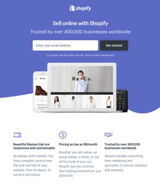
This page does several things correctly. It uses a simple color scheme, a short headline and subhead, an eye-catching image, and a very obvious call-to-action (provide your email address and click the big button).
It does provide some extra information in the bottom third of the page, for anyone interested in reading more, but the location of the call-to-action near the top makes their desired goal clear.
Landing pages are a specific type of web page, with the sole purpose to capture the visitor's attention and get him to take an action.
Proper attention to the tips above will ensure that your landing page delivers the results you want in the most effective manner.
Take a look at the landing page we use for our newsletter signups.
Have you used landing pages before? Were they effective? Hit the button below and share your experience!
Let Us Know!1 Pay per click (PPC) ads can be placed on the website networks of Google, Facebook, Amazon, and others
2 Lead magnets are types of free content providing useful information in exchange for an email address, a phone number, a visit to your website, etc.
3 Content marketing is an approach focused on producing valuable and relevant content to attract a clearly-defined audience